Responsive Web Design Explained: From Fixed Width to Fluid and Adaptive Layouts
Ever heard of responsive design, adaptive design, or fluid layouts and had no clue what they meant? It happens to the best of us! Picture this: You’re revamping your website, and your developer starts throwing these terms around without explaining a thing. Talk about confusing, right? Well, worry no more! We’ll unravel the mystery behind these web design buzzwords and walk you through their history and differences. Say goodbye to confusion and hello to websites that look great on any device. Get ready to rock the web!
Introduction
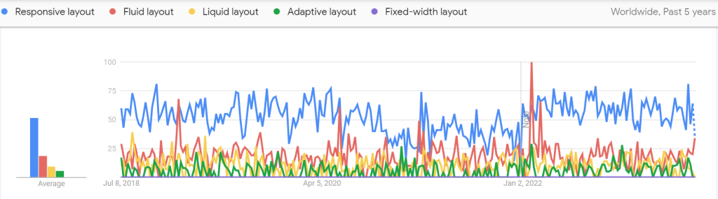
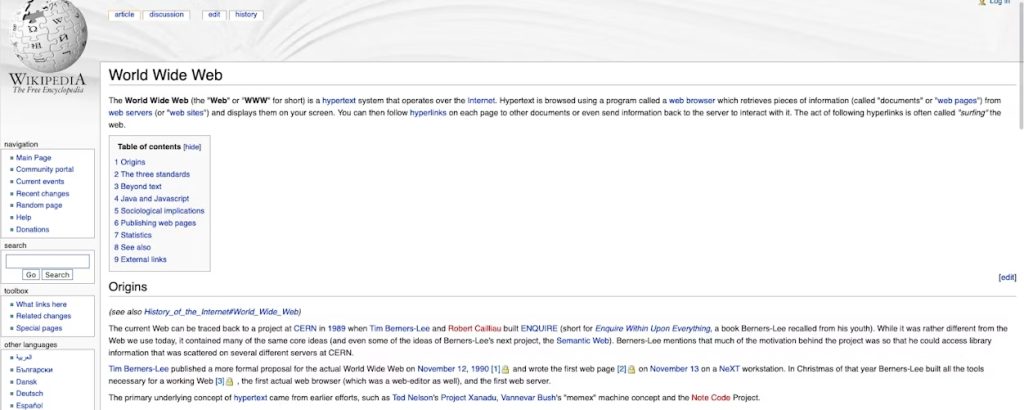
Responsive web design is an approach to building websites that ensures they look good and function well on any device, regardless of its screen size or orientation. This approach, which emerged in the early 2010s, was a response to the increasing variety of devices people use to access the web. From desktop computers and laptops to smartphones and tablets, web designers faced the challenge of creating websites that could adapt to different screen sizes and provide a seamless user experience. Let’s walk through the history that led to this approach.
Fixed-width design
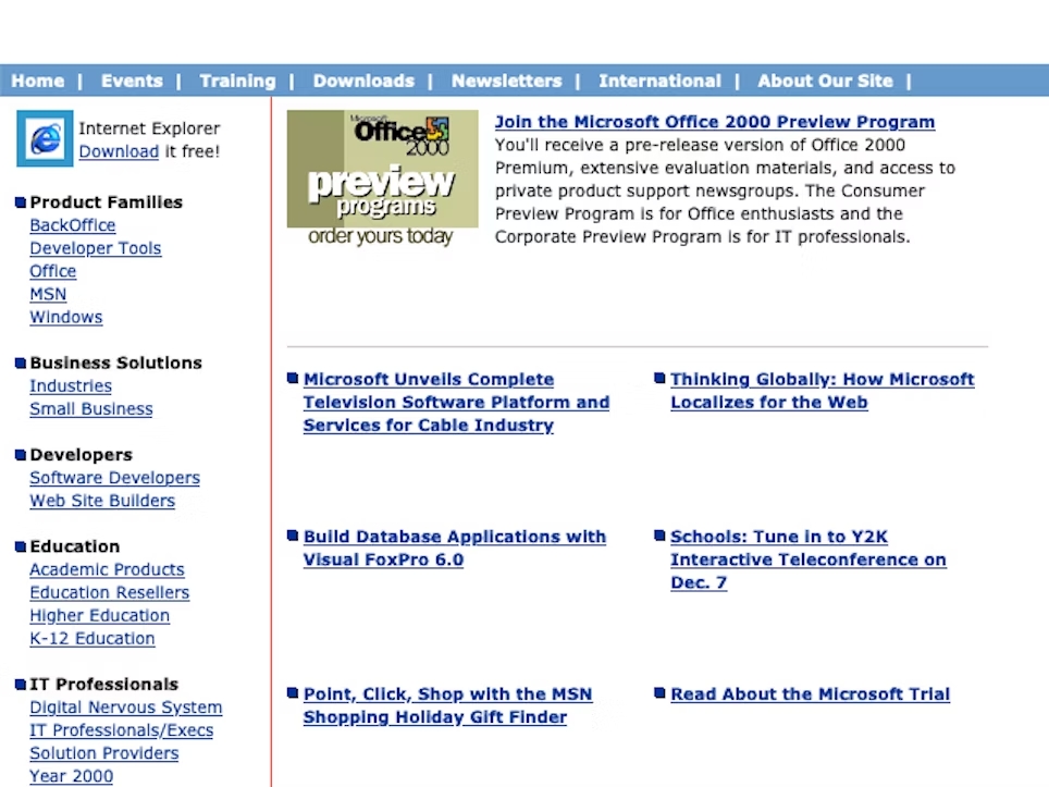
In the early days of web design, websites were typically designed with a fixed width, such as 640 pixels or 800 pixels, to accommodate the screen sizes of most desktop computers at the time. This approach, known as fixed-width design, worked well on standard-sized screens but posed problems when viewed on smaller or larger screens. The content either appeared too cramped or got lost in excessive white space.
Fluid layouts
To overcome the limitations of fixed-width design, in the early 2000s web designers introduced fluid layouts, also known as liquid layouts or flexible layouts. These layouts use proportions, not specific measurements, to decide how wide different parts of a webpage should be. It’s like telling the website, “Make this part take up 30% of the available space.” This flexibility allows the content to adjust and fit nicely on screens of different sizes.
However, there are some challenges with fluid layouts. On wide screens, the content can look stretched out, making it difficult for the eyes to follow from one end to the other. On narrow screens, the layout can appear squashed, making it harder to read and interact with the website.
Adaptive layouts
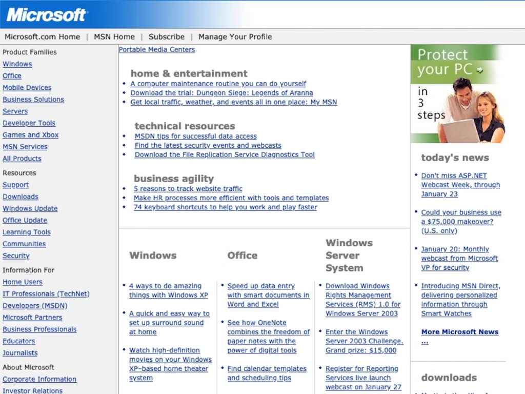
In the late 2000s, adaptive layouts became popular as a way to handle different screen sizes. With adaptive layouts, developers created multiple fixed-width layouts specifically designed for various types of devices.
During this time, as mobile devices were becoming more common, adaptive layouts were used to upgrade older websites that weren’t originally built for mobile-friendly experiences. Some larger companies also used adaptive layouts to create separate designs and functions for desktop and mobile users, using different sets of code for each layout.
While adaptive layouts improved the user experience compared to fixed-width designs, they required more work from developers because they had to create different layouts for different devices.
Responsive web design
Responsive web design was introduced in the early 2010s to make websites adapt smoothly to any screen size. Unlike adaptive layouts, responsive layouts don’t need different code for different devices. Even though adaptive and responsive designs may look similar and both adjust to the user’s screen size, they work differently behind the scenes.
With responsive design, websites magically adjust their layout and images to fit perfectly on any screen. Imagine a website that knows how to look great on a computer, a laptop, a tablet, or a phone, without the need for separate versions. Responsive design uses special tricks to achieve this, but we won’t get into the technical details.
The idea of responsive design revolutionized the way websites are built. It empowered web designers to create sites that smoothly adapt to different screens. Now, websites can give everyone a consistent and enjoyable experience, no matter if they’re using a computer, a phone, or anything in between.
Thank you for your interest in this subject! Please feel free to leave a comment with any thoughts you have while reading this article.
I would also like to express my gratitude to Google Developers for their course on Learning Responsive Design, which provided inspiration for writing this piece!


 EN
EN  RU
RU